A brand guidelines book for Woodlynde School. It includes a comprehensive set of logo versions, fonts, colors, icons, graphics, patterns and Microsoft templates.
"Not only did Kristen support me with presentations and major programs, but she provided everyone at Woodlynde a resource site that contained the graphic design elements she created with instruction so that we could enhance our own documents and presentations.
She gathered evidence from a wide range of schools to determine the colors, fonts, and visual elements that would distinguish our school and literacy center from other schools and would attract attention in the best way."
— Penny Moldofsky, Director of the Center for Literacy and Learning at Woodlynde School
The Challenge: Woodlynde School is only one of many Main Line Philadelphia independent schools for students with learning differences. How do you make one small school (with an amazing proven curriculum and warm community) stand out to prospective families in such a saturated market?
The Solution:
Step 1: Research — What do competitor's colors and design styles look like? Compile everything into one document and notice what color schemes are not often used so Woodlynde doesn't look like every other school who has navy and white as their colors.
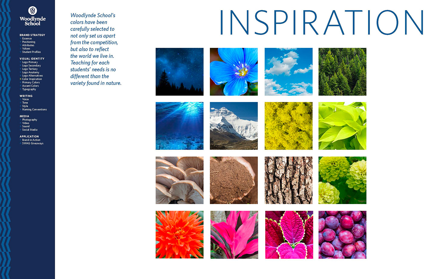
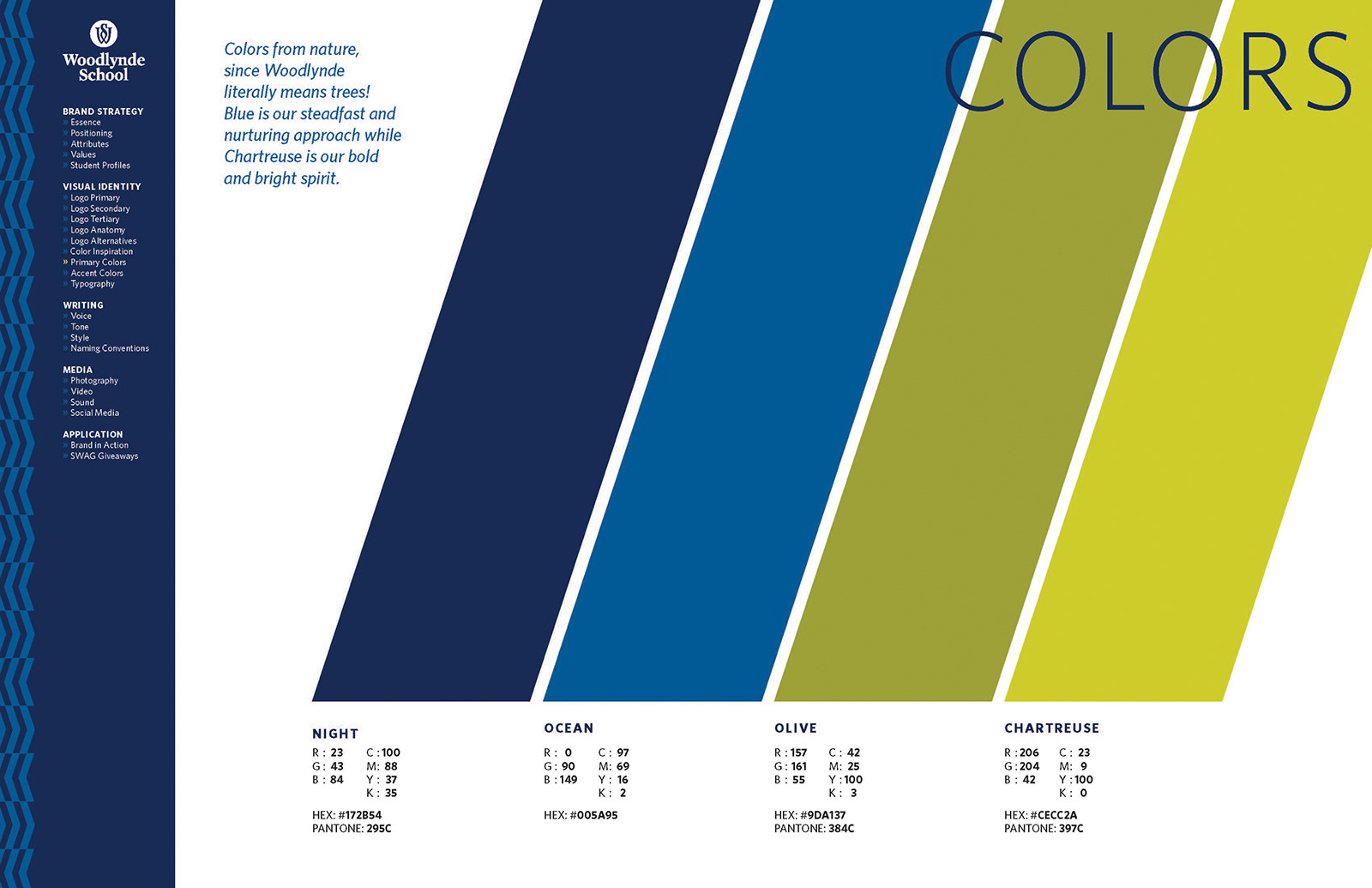
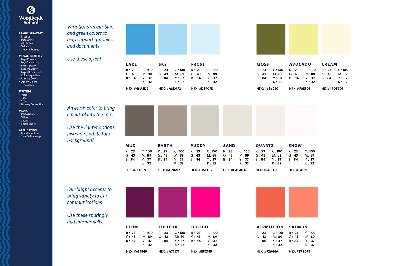
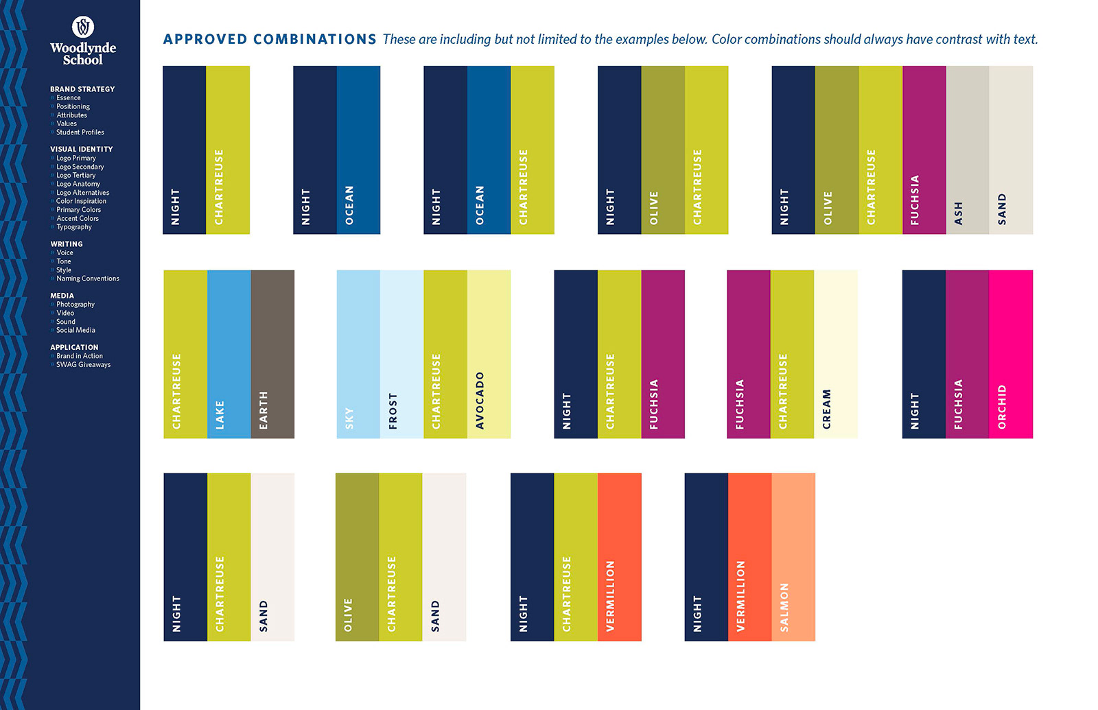
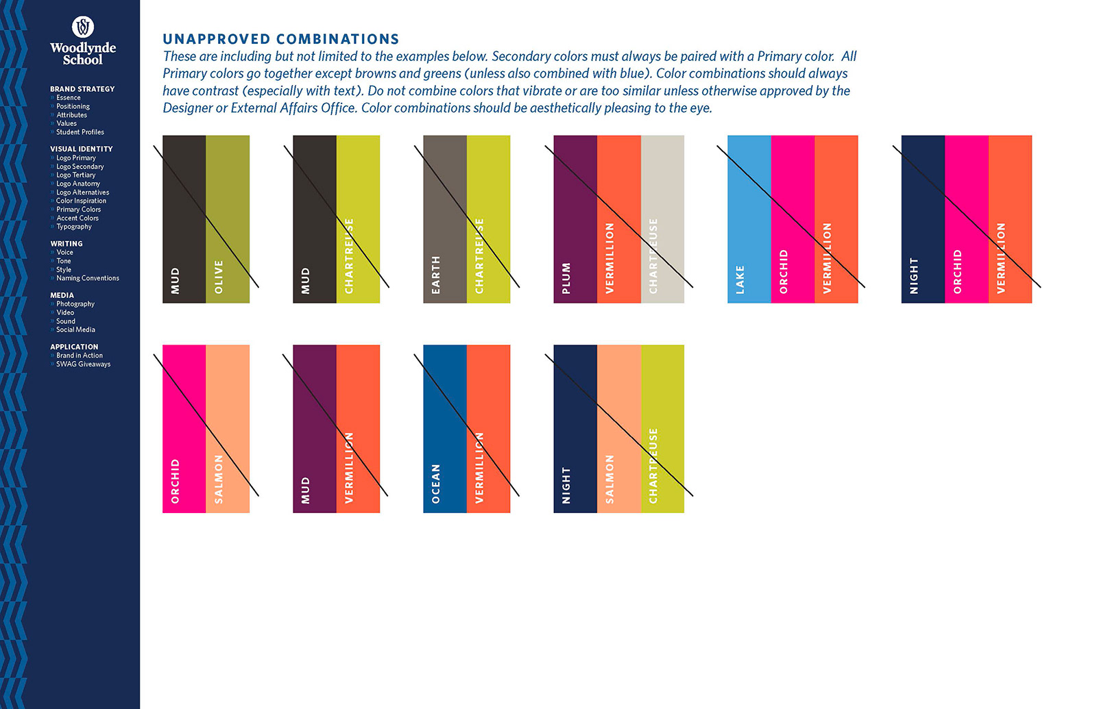
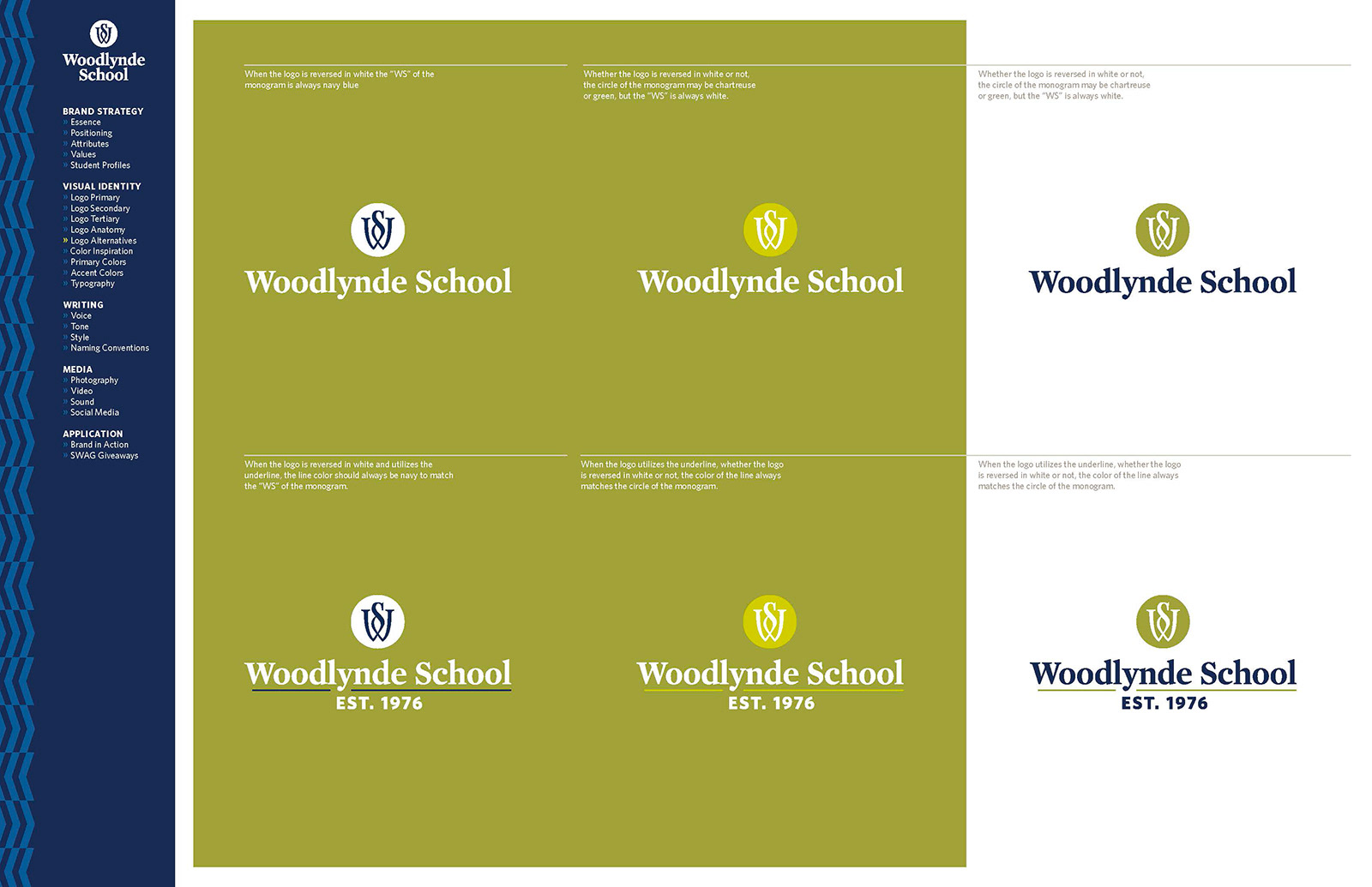
Step 2: Colors — Refresh the old terracotta brown accent color to something more energizing (and isn't used by any other school in the market...chartreuse! One of the priorities in choosing this color and other accent colors was leaning into the natural world that the name Woodlynde suggests. The word -lynde actually means ‘tree’ or ‘trees’ in Middle English. So, blues and greens were a natural choice. Chartreuse and olive green evoke trees in full bloom and lush grass while our blues suggest water and the sky.
Step 3: Fonts — Adjust the fonts to something more welcoming and friendly, Whitney, strong and bold that invoke a Warrior spirit, Saracen, and keeping Mercury as the main school official document font to have some consistency with the original brand and logo, plus it also plays nicely with the other two. Factoria font was added in later to be used for in-house signage, the school newspaper, and the school news show, Woodlynde Weekly. It's a free font that could be easily added to colleague laptops without purchasing additional licenses, saving the school money.
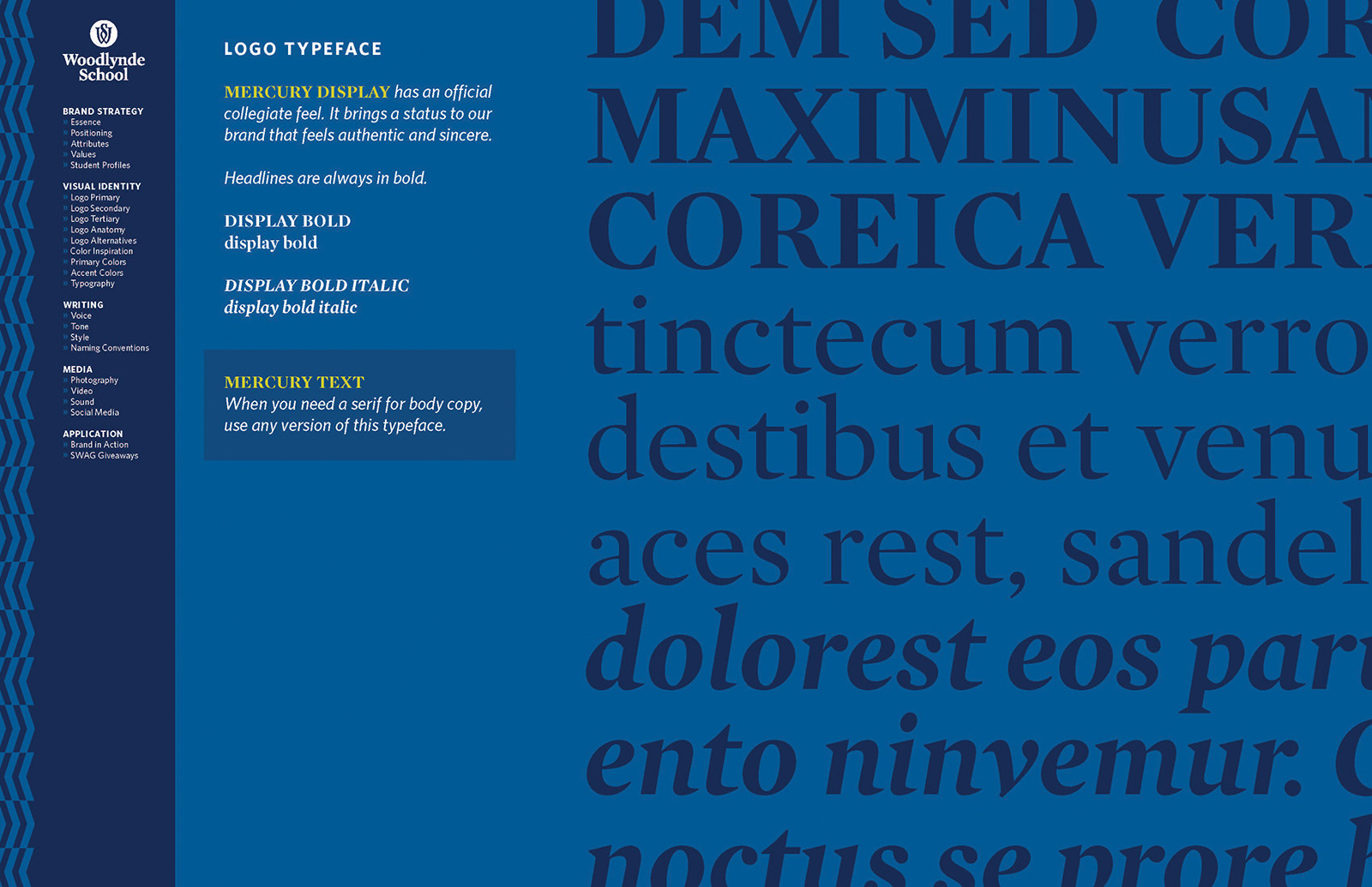
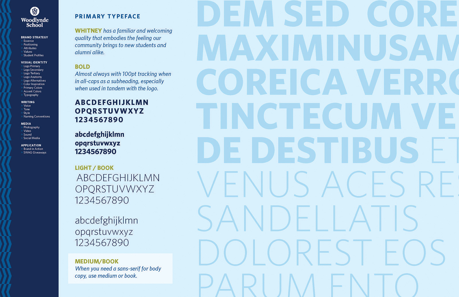
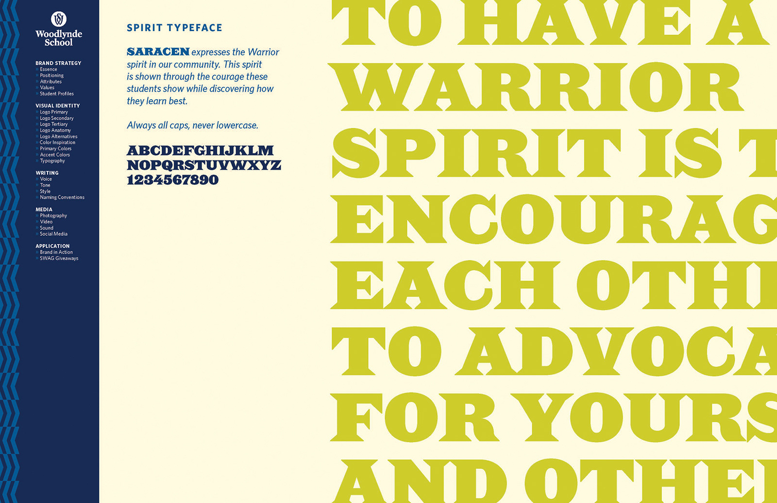
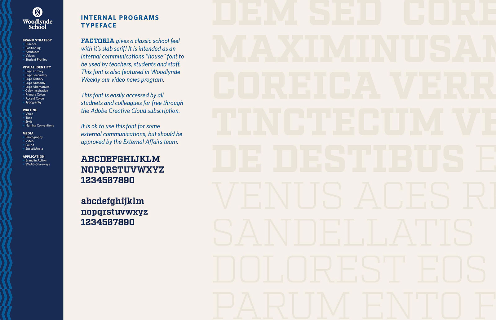
Step 4: Logo — Revitalize the logo a little bit. Tweaking the logo so it's balanced and the name is slightly bolder allowed it to hold up when printed small and it matched the new branding a little better. It invokes a feeling of strength and advocacy while the previous version was skinny and didn't contain much personality.

Step 5: Graphics — The chevron mimics the architectural angles of the new construction, while the bold accent font, Saracen, has a Greek- or Roman-esque warrior's style that gives off a sense of confidence to the "Woodlynde Warrior" brand.
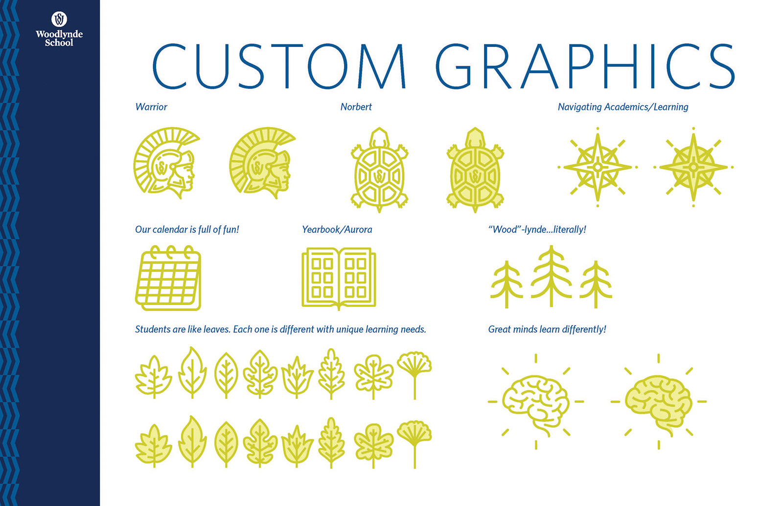
All of my motifs and icons—wood grains and leaf patterns, miniature "Norbert" the turtle and tree lines—also reflect this natural bend in Woodlynde's brand. Chartreuse is heavily associated with a sense of revival, youthfulness, and being bold. Those are all associations Woodlynde wants families to have with their school and students. Woodlynde School is a fun, creative place, and the previous color palette of terracotta, navy and white wasn’t conveying that to the public.
