

Woodlynde School welcomes and serves students who learn differently and empowers them to become strategic thinkers and self-advocates in a challenging and supportive college preparatory environment.
When I first begun working for Woodlynde, you could tell they had a strong tight knit community that really felt different from any other school environment I'd ever witnessed. The students were so welcoming, understanding and supportive of each other, as well as the teachers, staff and parents. It is a bright and warm community with a unique entrepreneurial spirit. It deserved a brand that represented it well — I believe my team and I were able to accomplish this ten-fold!
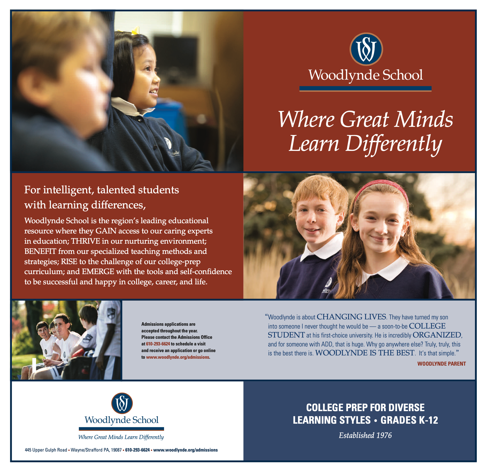
The Pre-Existing Brand
The brand before I made any changes was not bad, it felt collegiate and exactly what you would expect from a private school. Their colors were Terracotta, Navy and White, though no one in the school really enjoyed or felt tied to the terracotta color. They had more brand guidelines but they did not use them.
Here are some examples of the pre-existing brand:


The Logo
The logo has an interesting history tied to some of the school's colleagues so I wasn't about to change the mark itself, but I did clean up the sizing, spacing and gave it some rules for use to stay consistent!
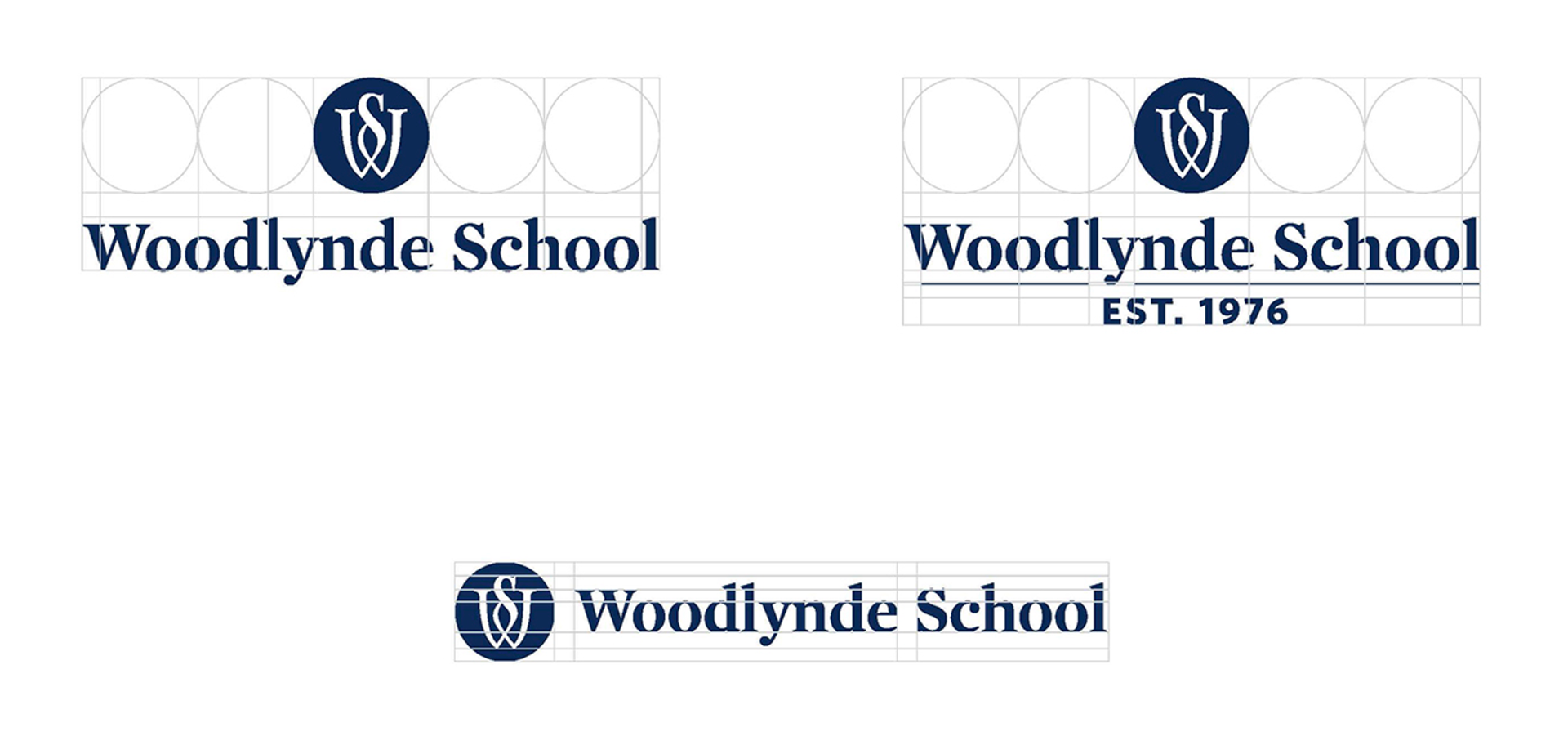
I also built out various versions for different use cases. Each version has it's white and chartreuse counterparts.

Branding Inspiration

Spirit Colors and Accents


Fonts

Mercury was already an established font within the pre-existing brand. It's the font used in the logo. It feels collegiate, classic and timeless. I opted to keep this because of it's neutral nature and it ties together the old brand and new brand in the minds of those who knew the school before and current parents, students and colleagues.

Whitney was an obvious choice. Woodlynde needed a sans serif that felt friendly and approachable.
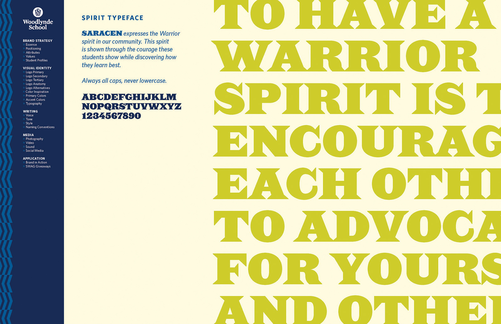
Saracen is the accent font or as I like to call it the spirit typeface. It encompasses the vibe of the warrior spirit. Saracen has a roman old-world style but with a modern kick to it. It also allows for bold statements and headings on certain school materials and promotional SWAG.
