Students who join Woodlynde School become "Warriors". This mascot stems from the idea that every student is on their own path of self-advocacy and adding more tools to their backpack to help them thrive throughout each stage of their lives.
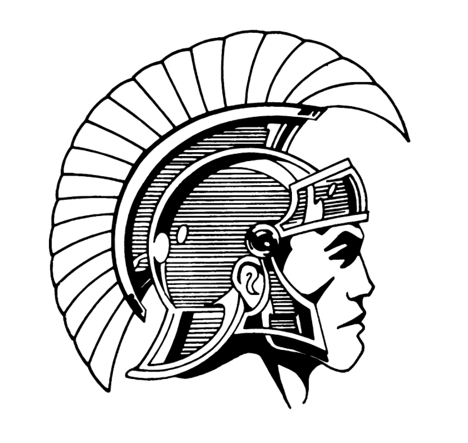
The Problem: Below is the original logo. The origins are not clear but it is likely a copyright free image such as ones found in vintage Dover stock artwork books. This logo was a rasterized jpeg, and the same exact image was used for a variety of different schools in Pennsylvania and beyond. Woodlynde needed something to stand out and unique that matched the new brand.
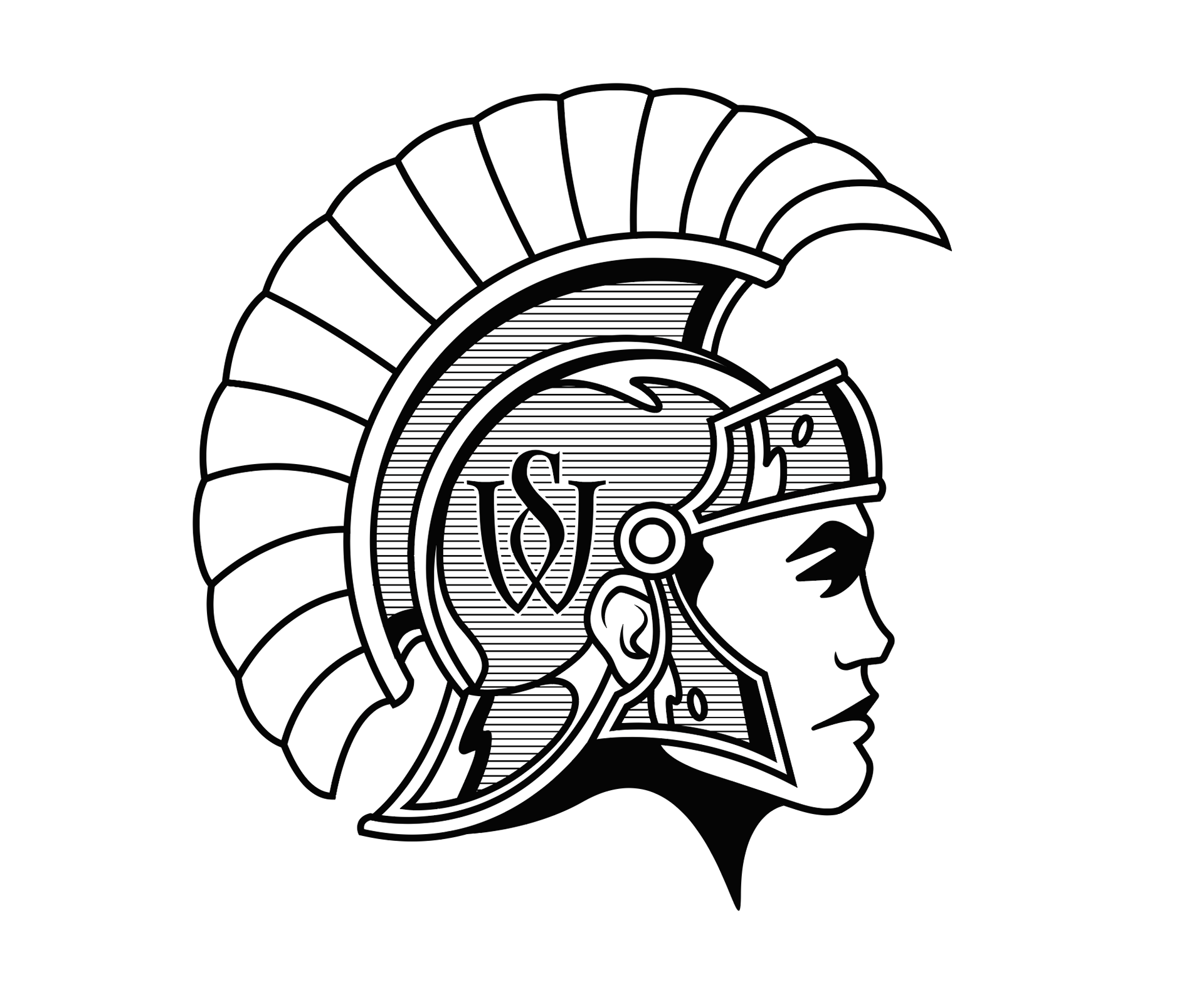
The Temporary Solution: At first we didn't want to deviate too much from the original. The original image was used for nearly 45 years — it was sentimental to the community, so I had to honor that.
First, I softened the face, cleaned up the shape of the plume, and added the WS monogram from the regular Woodlynde logo. Most importantly, this version was vector to be more versatile!

Below is the complete updated graphic. This was used for a while, but it is clear there were more changes that needed to be made. It's still too similar to the original and needs to become more unique to Woodlynde to stand out against the competition, on the court, field and the admissions office.
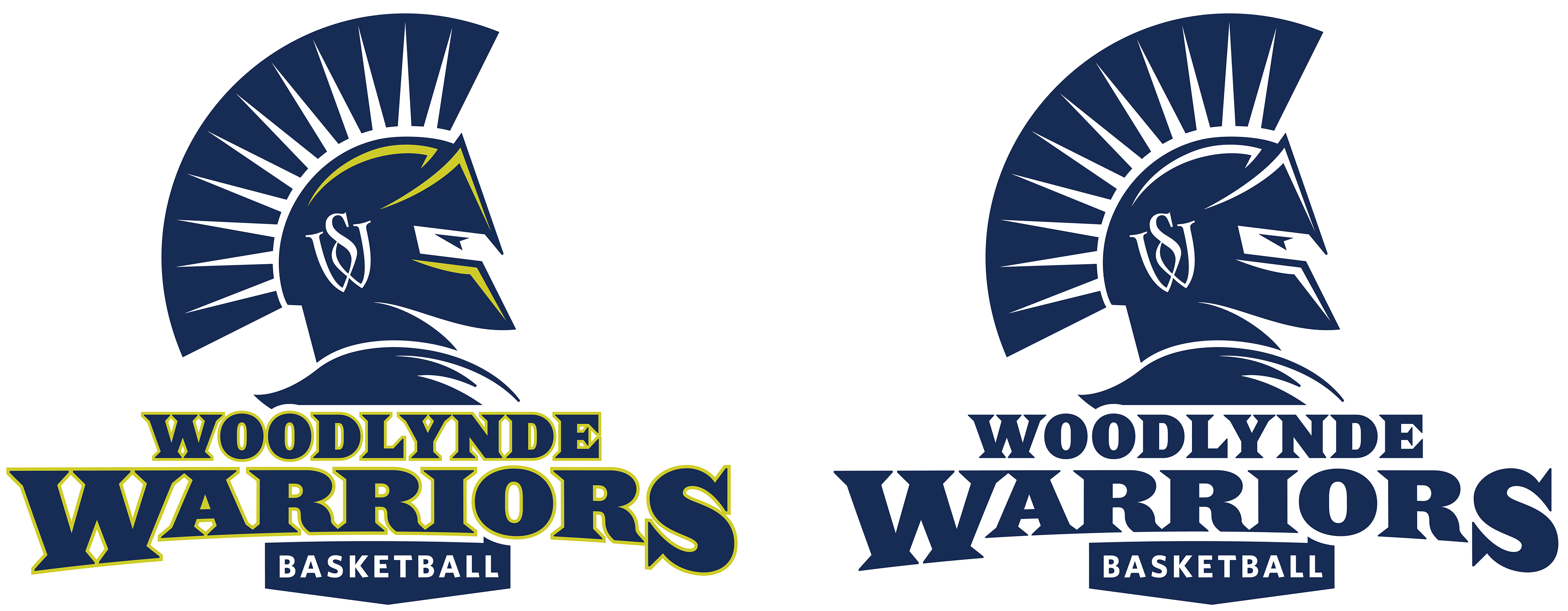
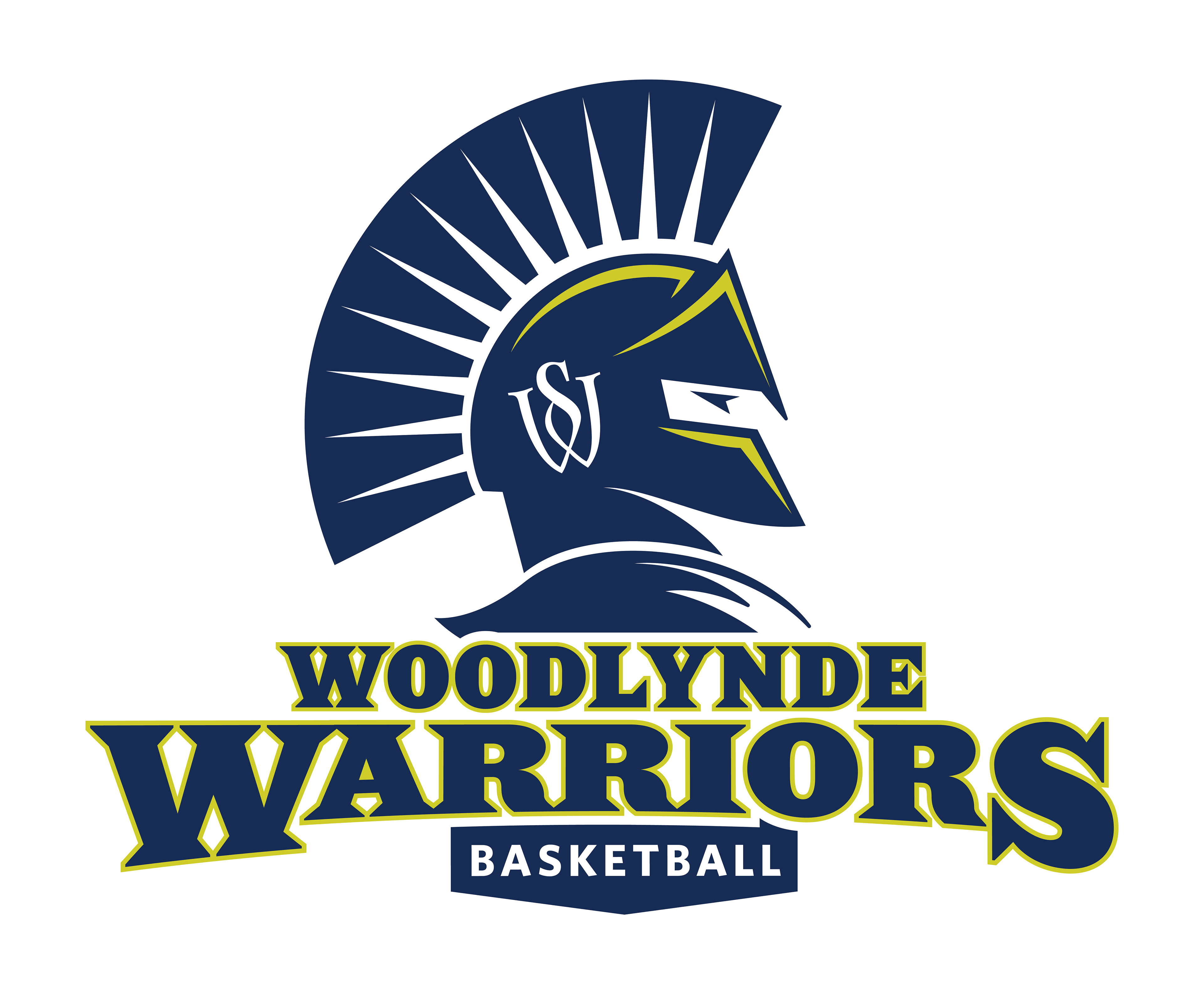
The Final Solution: The new athletics logo is fierce, sharp, with the warrior lifting their head high with confidence. The "rays" separating the plume highlight the bright minds at Woodlynde despite their learning differences. They put on their armor of self advocacy, belonging, and strategic thinking to face any challenge.
This new logo is modernized to match more what you see in modern sports logos. It has a regal confident look to it. Woodlynde's signature chevron shape is used throughout to inform the angles. The tag at the bottom "basketball" can be replaced with any sports team type that they offer now and in the future.